Um, Criterion released The Lady Eve in the UK four years ago.Finch wrote: ↑Sat Mar 16, 2024 12:54 pmI'm not saying that it makes a lot of sense objectively and I get that it's really about the film than the cover but in Eve's case, I find the cover so cringe-inducing that I'd really rather wait longer still to see if one of the UK boutiques releases the film (Criterion UK have not done so far), possibly with better encoding too. I'll buy this Criterion BD as an absolute last resort if nothing else materialises but this is a very rare instance of the packaging putting me off completely. I don't have the time or talent for custom-making a new cover based on the theatrical poster which they did use for the DVD.
Criterion & Eclipse Cover Art & Packaging Babble-on Vol. 7
-
dwk

- Joined: Sat Jun 12, 2010 6:10 pm
Re: Criterion & Eclipse Cover Art & Packaging Babble-on Vol. 7
-
Finch

- Joined: Mon Jul 07, 2008 5:09 pm
- Location: Edinburgh, UK
Re: Criterion & Eclipse Cover Art & Packaging Babble-on Vol. 7
guess I'll have to live with the atrocious cover and disc menus then. Thanks for clarifying.
-
therewillbeblus

- Joined: Tue Dec 22, 2015 3:40 pm
Re: Criterion & Eclipse Cover Art & Packaging Babble-on Vol. 7
Don't get me wrong, I "get" not wanting to own something that you pull off the shelf and shudder at. But I also tend to plan my purchases around what I'm in the mood for (barring certain LEs/indications of licensing lapsing, etc.) so I'll spring for an Arrow LE because I don't want to wait months for a standard edition, even though I don't want all the stuff inside that doubles its price and bloats the package to deprive me of precious shelf space. Likewise, when I was really in the mood to watch The Lady Eve and Cluny Brown (which was, of course, upon release!) I wasn't going to deny myself that pleasure because of a few seconds of looking at a cover.
On the flip side, if you haven't had a strong desire to watch any of these movies with a bad cover, I don't see a problem with the logic. What becomes confusing is - if you really want to see a movie and then deprive yourself of that opportunity because of something that (to me) feels superfluous, even just temporally, next to all those longer-lasting sensations that drive us to the love of movies to begin with. But again, I put less stock in packaging and extras than others here, which doesn't make me right and others wrong. I'm just primarily here for the movies themselves, and set my purchase prioritizations accordingly. A movie's spine would have to have a message of personal offense to my deepest insecurities for me to alter that
On the flip side, if you haven't had a strong desire to watch any of these movies with a bad cover, I don't see a problem with the logic. What becomes confusing is - if you really want to see a movie and then deprive yourself of that opportunity because of something that (to me) feels superfluous, even just temporally, next to all those longer-lasting sensations that drive us to the love of movies to begin with. But again, I put less stock in packaging and extras than others here, which doesn't make me right and others wrong. I'm just primarily here for the movies themselves, and set my purchase prioritizations accordingly. A movie's spine would have to have a message of personal offense to my deepest insecurities for me to alter that
-
zedz

- Joined: Sun Nov 07, 2004 7:24 pm
Re: Criterion & Eclipse Cover Art & Packaging Babble-on Vol. 7
I guess the question is why you would commission or design something to look like ubiquitous AI art.Grand Wazoo wrote:I'm kind of baffled that people the internet over think this is actually AI art given it's a cover Criterion presumably commissioned vs., to reiterate what I posted earlier, it having the texture of AI art. That smooth skin effect just looks so similar to the images Dall-e and its ilk spit out which have proliferated across Twitter and such for a while now. While the artist shouldn't be terribly shocked at the comparisons due to the unfortunate new ubiquity of that style, I too would be pissed if people were accusing me of simply typing in a prompt and sending it to Criterion for a check.
(Especially since there’s nothing else design or drawing wise to distinguish the work. Nice fonts though!)
-
Fred Holywell

- Joined: Thu Jun 10, 2010 11:45 pm

-
acroyear

- Joined: Sun Sep 23, 2012 10:22 pm
Re: Criterion & Eclipse Cover Art & Packaging Babble-on Vol. 7
After all the time my attention was diverted by the artwork I realized how much I love how the "wacky C" intertwines with the Q.
-
DimitriL
- Joined: Thu Jul 24, 2014 6:07 pm
Re: Criterion & Eclipse Cover Art & Packaging Babble-on Vol. 7
Because 1) it fits thematically and 2) that’s been part of the artist’s style since long before generative AI.
I think it’s a fascinating piece of work. Especially since it’s partly hand-painted.
-
olmo

- Joined: Wed Jul 16, 2014 1:10 pm
Re: Criterion & Eclipse Cover Art & Packaging Babble-on Vol. 7
I'm a huge fan of the commissioned artworks. The chiaroscuro work of Jennifer Dionisio, Eric Skillman's intelligent & tasteful design to name but two. The reinterpretation of the artworks is always interesting but of course not always successful in pleasing everyone (how is that even possible?) yet to dismiss all is either silly and betrays an agenda here.Randall Maysin Again wrote: ↑Sat Mar 16, 2024 7:31 amTo me anyway, Criterion's covers are consistently proof that you can't "buy" talent or a sense of style. I mean, compare their covers consistently to those of Masters of Cinema, or at least to the early Masters of Cinema covers. (Yes, I know that Criterion use a whole bunch of different artists), but there's a consistent Criterion cover look, or perhaps several phases of Criterion looks over the years, and to me they all kinda stink. I mean, it takes a special kind of lack of design instincts to think that you need to, or should, "improve" upon the original Amarcord poster art, for instance, by hiring an artist to just essentially imitate the original but really accentuate lines and color so everyone looks like a sunburned, plastic-surgery-mishapped freak!
-
Randall Maysin Again

- Joined: Tue Dec 14, 2021 3:28 pm
Re: Criterion & Eclipse Cover Art & Packaging Babble-on Vol. 7
Lol, I have an "agenda". I wonder what it might be?
-
Randall Maysin Again
- Joined: Tue Dec 14, 2021 3:28 pm
Re: Criterion & Eclipse Cover Art & Packaging Babble-on Vol. 7
I'm actually curious what you think my agenda is! I'm all ears.
-
olmo
- Joined: Wed Jul 16, 2014 1:10 pm
Re: Criterion & Eclipse Cover Art & Packaging Babble-on Vol. 7
Fine, you have no agenda and dismiss all of the artworks of one particular boutique label.Randall Maysin Again wrote: ↑Sun Mar 17, 2024 12:40 pmI'm actually curious what you think my agenda is! I'm all ears.
-
Randall Maysin Again
- Joined: Tue Dec 14, 2021 3:28 pm
Re: Criterion & Eclipse Cover Art & Packaging Babble-on Vol. 7
Okay, there's a handful or two I think are decent or a bit better than that. I do genuinely think the vast majority are hapless and suck, though.
-
TechnicolorAcid

- Joined: Wed Oct 11, 2023 7:43 pm
Re: Criterion & Eclipse Cover Art & Packaging Babble-on Vol. 7
Seems a tad mean but in some regard my interest is peaked, if most of them suck then which ones off the top of your head would you say you think are decent?Randall Maysin Again wrote: ↑Sun Mar 17, 2024 2:05 pmOkay, there's a handful or two I think are decent or a bit better than that. I do genuinely think the vast majority are hapless and suck, though.
-
Randall Maysin Again
- Joined: Tue Dec 14, 2021 3:28 pm
Re: Criterion & Eclipse Cover Art & Packaging Babble-on Vol. 7
I like pretty well some of the more simple covers/designs that presumably take their cue from poster art or the film's title designs, like Le Million or Charade. I like the current cover for All That Heaven Allows (and i also enjoyed their original design for that film). I actually also moderately like some of their more recent Old Hollywood covers--like The Philadelphia Story, and their revised design for The Lady Eve which Finch hates! (The original for the latter was considerably better though.) I love their art for Spartacus and that seems to be original...I think. I like their new design for The Devil and Daniel Webster a lot, though the artist could have done better at capturing Walter Huston, it doesn't really look like him as he is in the film. But there's none, or almost none, that I would call outstanding, except maybe a few like Spartacus, and even among those, they're mostly kind of minimalist and it seems like they didn't actually take too much effort. So maybe I should revise my original statement to be: maybe 10-15% of Criterion's covers are pretty good or better, and the majority of those are taken completely or in large part from some pre-existing design and just don't fuck with it too much. The rest are either barely okay or outright dross.
-
TechnicolorAcid
- Joined: Wed Oct 11, 2023 7:43 pm
Re: Criterion & Eclipse Cover Art & Packaging Babble-on Vol. 7
I will agree that those are good covers but it appears you’re mistaken on Spartacus, per Criterion:
Cover based on a theatrical poster by Saul Bass
-
Randall Maysin Again
- Joined: Tue Dec 14, 2021 3:28 pm
Re: Criterion & Eclipse Cover Art & Packaging Babble-on Vol. 7
My bad. I suspect all of my favorites are like that....
-
DimitriL
- Joined: Thu Jul 24, 2014 6:07 pm
Re: Criterion & Eclipse Cover Art & Packaging Babble-on Vol. 7
Looking the process of any given Criterion cover, the one thing that becomes evident is that absolute gobsmacking amount of thought, labor and variations that goes into every single one of them. I mean, you may not like the collective work of literally dozens of individual artists, but the concept of a Criterion cover is so beloved that they put out an entire book collecting them.Randall Maysin Again wrote: ↑Sun Mar 17, 2024 2:42 pmI like their new design for The Devil and Daniel Webster a lot, though the artist could have done better at capturing Walter Huston, it doesn't really look like him as he is in the film. But there's none, or almost none, that I would call outstanding, except maybe a few like Spartacus, and even among those, they're mostly kind of minimalist and it seems like they didn't actually take too much effort.
And also don't forget that in many, many of these cases, the director directly okayed them, which is more say than they likely got during the original theatrical run.
-
Randall Maysin Again
- Joined: Tue Dec 14, 2021 3:28 pm
Re: Criterion & Eclipse Cover Art & Packaging Babble-on Vol. 7
Not to be too snippy, but I am a little leery of this argument in just about any context, unless its the artist's work itself (and even then, sometimes...). In the case of Criterion, it seems plausible to me that there may be some directors in question who just were being polite and didn't want to refuse countless cover after cover.
-
Walter Kurtz

- Joined: Sat Jul 25, 2020 3:03 pm
Re: Criterion & Eclipse Cover Art & Packaging Babble-on Vol. 7
I miss those black felt blacklight paintings they used to collectively display at corner gasoline stations. Dag nam it. Those were the days!
-
Randall Maysin Again
- Joined: Tue Dec 14, 2021 3:28 pm
Re: Criterion & Eclipse Cover Art & Packaging Babble-on Vol. 7
Back in my day, a chocolate bar only cost a nickel!
A nickel!!
A nickel!!
-
swo17

- Bloodthirsty Butcher
- Joined: Tue Apr 15, 2008 10:25 am
- Location: SLC, UT


-
cdnchris

- Site Admin
- Joined: Tue Nov 02, 2004 2:45 pm
- Location: Washington
- Contact:
Re: Criterion & Eclipse Cover Art & Packaging Babble-on Vol. 7
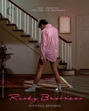
Well, my mother will like the Risky Business cover at least.
-
tenia

- Ask Me About My Bassoon
- Joined: Wed Apr 29, 2009 11:13 am
Re: Criterion & Eclipse Cover Art & Packaging Babble-on Vol. 7
They're mostly quite fine, I particularly like the simple yet effective design of Le Samourai, but am perplexed over the Concubine one with its empty space, and the Risky Business and Perfect Days ones feel like "take a screenshot, slap the layout title and credits and boom".
-
FrauBlucher

- Joined: Mon Jul 15, 2013 8:28 pm
- Location: Greenwich Village
Re: Criterion & Eclipse Cover Art & Packaging Babble-on Vol. 7
Looks like Pat Garrett and Billy the Kid will be a digipak
-
Finch
- Joined: Mon Jul 07, 2008 5:09 pm
- Location: Edinburgh, UK
Re: Criterion & Eclipse Cover Art & Packaging Babble-on Vol. 7
I find the empty space on the Farewell cover baffling, too, and the placement of the word Farewell is really awkward. Skillman could have applied some shadow to the title fonts if he was concerned about the title not standing out enough against the busy background.